Introducing Hive: A rebrand for Impactful Animal Advocacy
By Hive (formerly Impactful Animal Advocacy), Constance Li, Sofia Balderson, Kevin Xia, allisona @ 2024-05-07T04:45 (+4)
We are excited to announce that Impactful Animal Advocacy is rebranding as Hive, the same organization with a fresh look and feel.
After much thought and consideration, we envision Hive to better reflect who we are – capturing our collaborative spirit and commitment to generating impact within the farmed animal advocacy movement.
View the new and updated “us” at joinhive.org.
This change is, in part, a response to common feedback that the name Impactful Animal Advocacy is too long (10 syllables!), hard to remember, and difficult to recognize as the acronym IAA. While we believe Hive will allow us to better serve the community, we are so proud of our growth as IAA. Our new name won’t have the word “impactful” in it – but it’s still an important part of our mission: to end factory farming through creating impact-focused communities.
About our new brand
Through this rebrand, we are embracing a warmer and inviting image while staying true to our core values. We want to convey a sense of friendliness and approachability, combined with a rational and results-driven approach. This new chapter marks an important milestone in our growth, and we are excited to share it with all of you, our community.
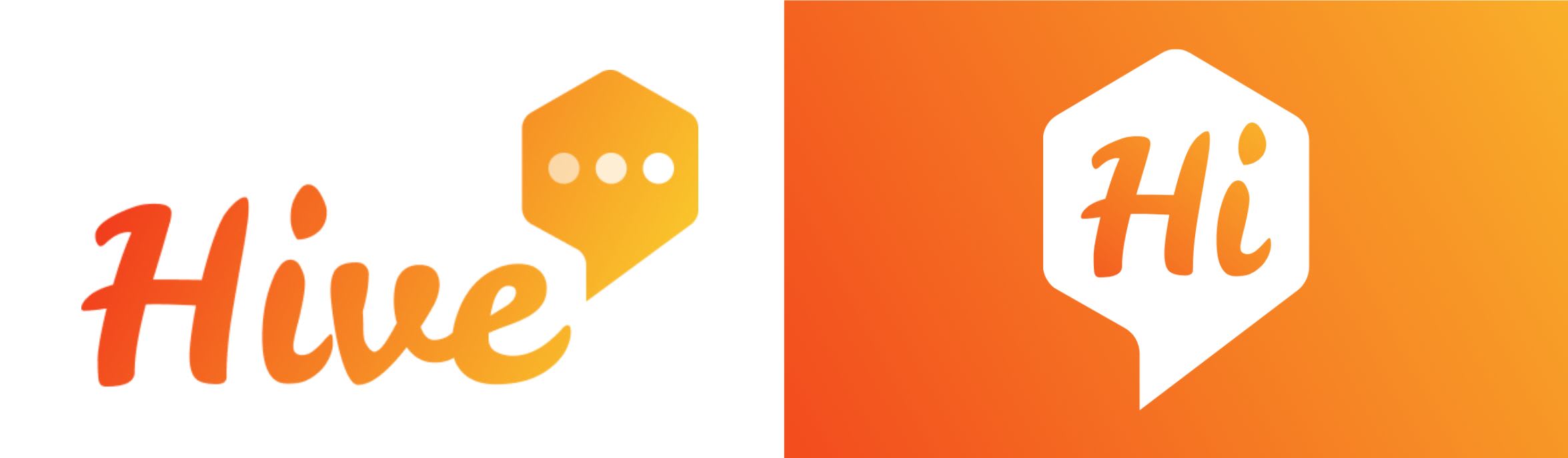
🐝Name: Hive
The word hive is a place full of activity, or in the context of bees, it’s a place where many gather. In our case, we hope that, together, we can produce more impact or value. Hive symbolizes collaboration and coordination, while still bearing a subtle animal element.
💬 Logo: Hexagon with 3 typing indicator dots
The hexagon is a reference to bee hives. The three typing indicator dots are common on digital platforms and help explain that we are largely an online community that thrives on communication.
🟧 Colors: Deep and light orange gradient
We think these warmer colors will help establish the brand as a place for fresh ideas and energy. The fluid nature of the gradient represents the diversity of viewpoints and collaborative nature of our community.
We can’t end the post without sharing appreciation to everyone that has helped us get here:
- We thank Vegan Hacktivists for the initial logo design and brand kit for IAA – it helped us get started quickly and we are thankful this service helps other orgs get off the ground also.
- Our trusted advisors and mentors have been critical in supporting us through all the organizational growth we experienced in 2023. Thank you to Cameron King, David Meyer and Tracy Spencer, Rockwell Schwarz, Aaron Boddy, Nicoll Peracha, Jay Barrett, Rachel Atcheson, Jacob Eliosoff, Monica Chen, David Nash, Steven Rouk, Wanyi Zeng, David Coman-Hidy, Tania Luna, Alyssa Greene-Crow, Nicole Rawling and Ana Bradley. You have all been so helpful and we appreciate your time.
- We also thank our funders and donors who have helped not just with funding but with valuable advice that helped us create and follow a focused and solid strategy: Open Philanthropy, Lush, Veg Trust, Craigslist Charitable Fund, and Humane America Animal Foundation, as well as individual donors who believed in us and supported us so early in our journey.
- Thank you to James and Amy Odene from User-Friendly who helped us come up with a new name and design the Hive logo and website. You have been incredibly helpful and patient in this process. We love the end product!
- All of our loyal Slack members – for being the impactful and helpful advocates that you are! We are so thankful to have you in our community.
(Not pictured: the 2,250+ other community members)
We’d love to hear what you think about our new name, logo, and website. Please send any of us a message on Slack, comment on the post, or send anonymous feedback here.